Last week we looked at Status Dashboards, how they show a snapshot in time of the system, using simple widgets like Stat Panel or Gauge and how they should be based on clear KPIs.
In this post, we will look at T&T Dashboards.
Troubleshooting & Trend Dashboards are the following level of dashboards you want in your system. Status dashboards would often surface a problem giving you a rough idea of what’s wrong with the system, be it throughput, excessive error rate, or latency, but they won’t tell you where the problem is.
So the next thing you want is to go deep into your system and get better insight into what’s going wrong. That’s when T&T Dashboards will help you.
Contrary to Status Dashboard, T&T Dashboard can and most likely will require interpretation; this doesn’t mean they HAVE to require interpretation, but the deeper you go, the harder it will be to abstract complexity.
One example of a Troubleshooting Dashboard can be seen below:
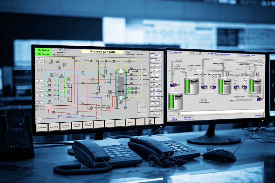
Image from https://www.qspec.com/wfi-controls-optimization-2/
This is the type of dashboards I used to see during my Automation Engineering courses when talking about SCADA systems.
This type of dashboard is very visual, and after a bit of training to understand how to read them, you should be able to quickly identify, not just IF something is going wrong but where the problem is.
Another classic example is the one you see below from the RFI operations room in Florence Campo di Marte.
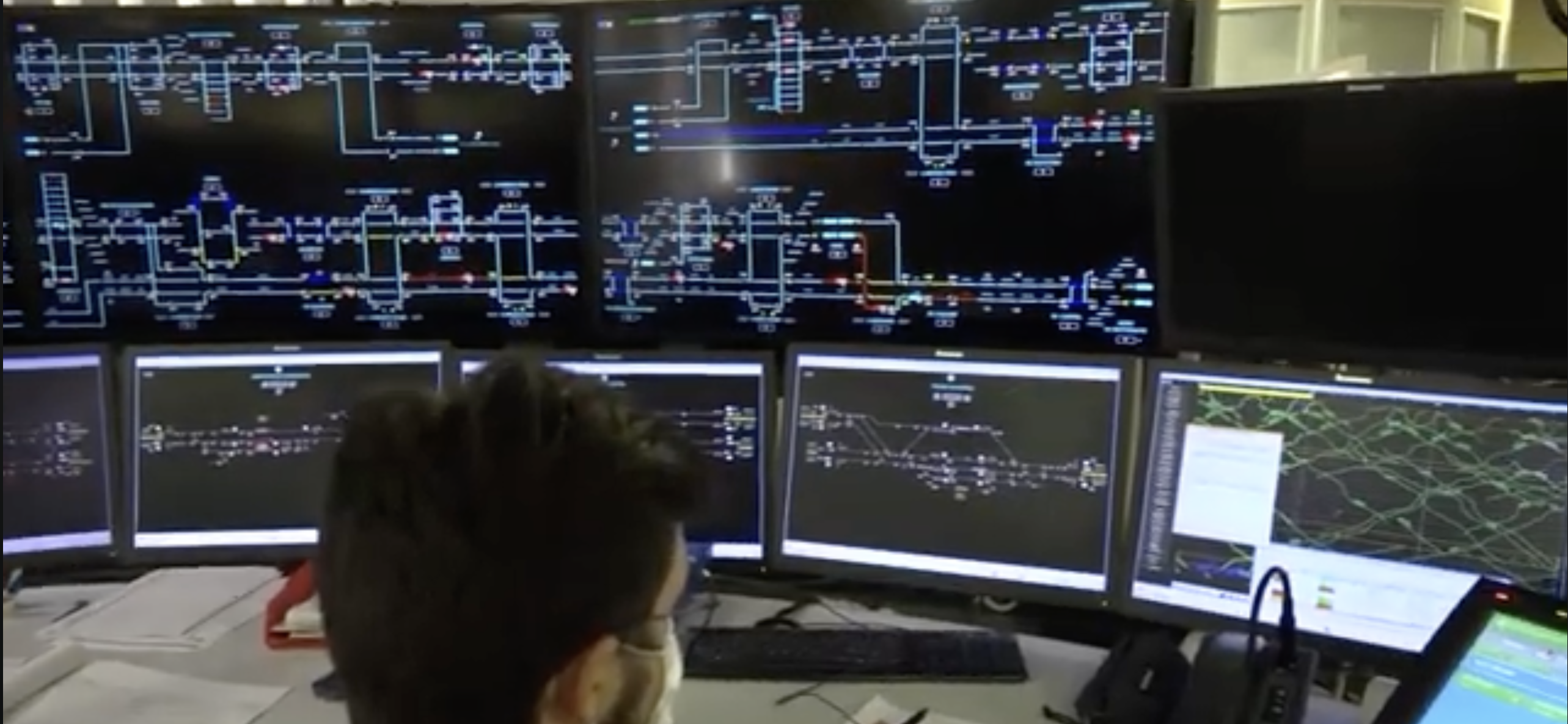
From:[ITA] https://www.youtube.com/watch?v=ZbwZaa84aQY
Here you can see a very complex system like the Italian railway infrastructure again monitored thanks to a series of monitors with a graphical representation of the system.
Naturally, Grafana supports this thanks to the canvas element, as you can see in the video below.
Do you have something like this in your company? If so, please reach out to me; I would love to chat about it; you can find me on Twitter, LinkedIn or Mastodon.
While it should be clear how the two examples above can be considered Troubleshooting dashboards, it’s also pretty clear how you don’t have any trends in there.
Trends
Trend dashboards are quite dear to me, they are the one that will potentially teach more about your system that any other dashboards. At the same time they are the type of dashboard that require a deep understanding of the system.
Looking at how a system behaves over time allows you to spot behaviours or trends ;).
The graph below is from my home automation; in the image, you can see the Humidity of one of my rooms in the last 30 days.
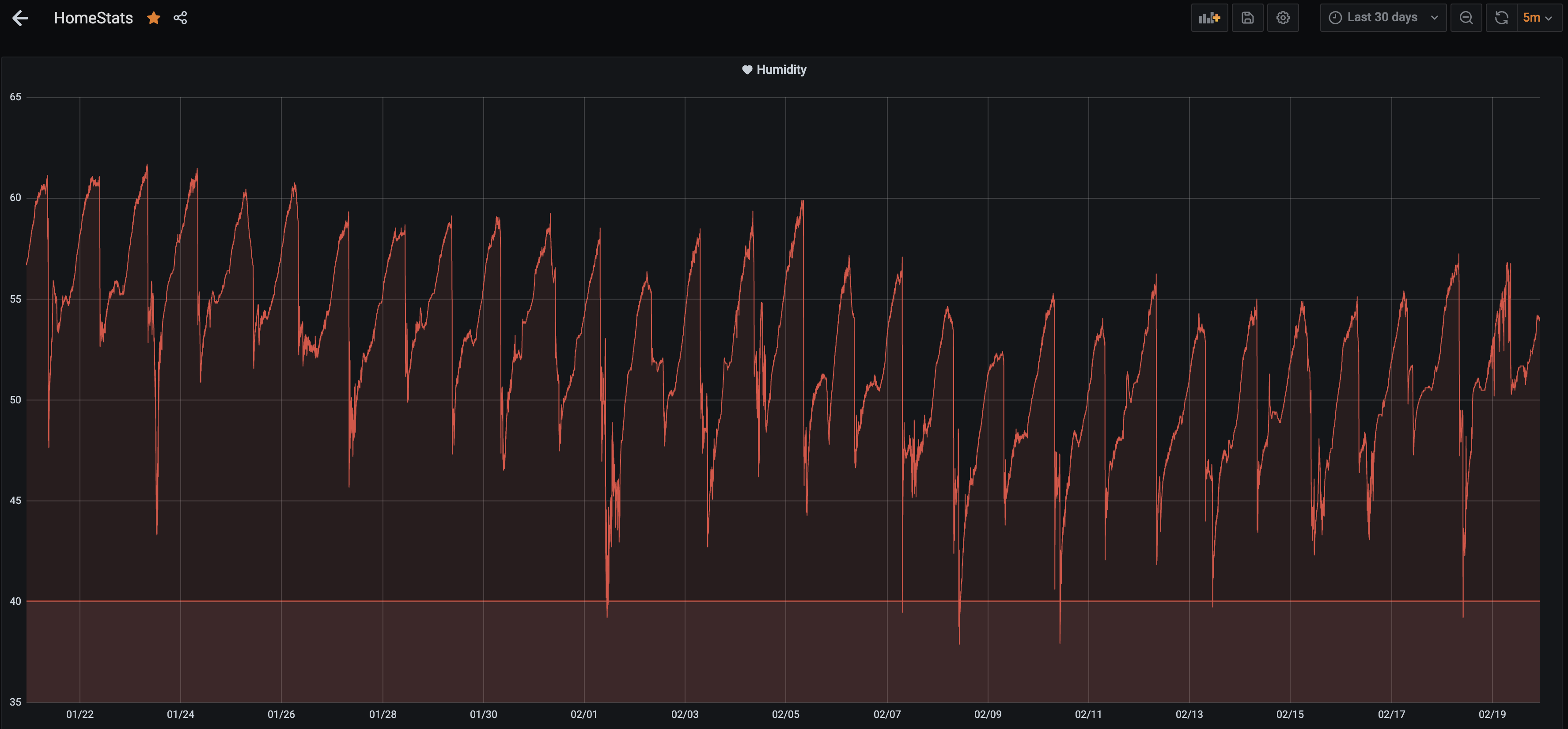
One of the obvious things to observe is that the humidity drops consistently almost once a day, but it also went down from 60% to 55% in the last 10 days. This is a simple system; you should know what affects humidity already, so you can guess what’s causing the repeating droppings.
But if the system is a bit more complicated, there is another powerful thing that you can use… correlation.
For the example above, we can test the hypothesis that it’s us opening the windows to cause the humidity drop by comparing this graph with the one that tracks the windows.
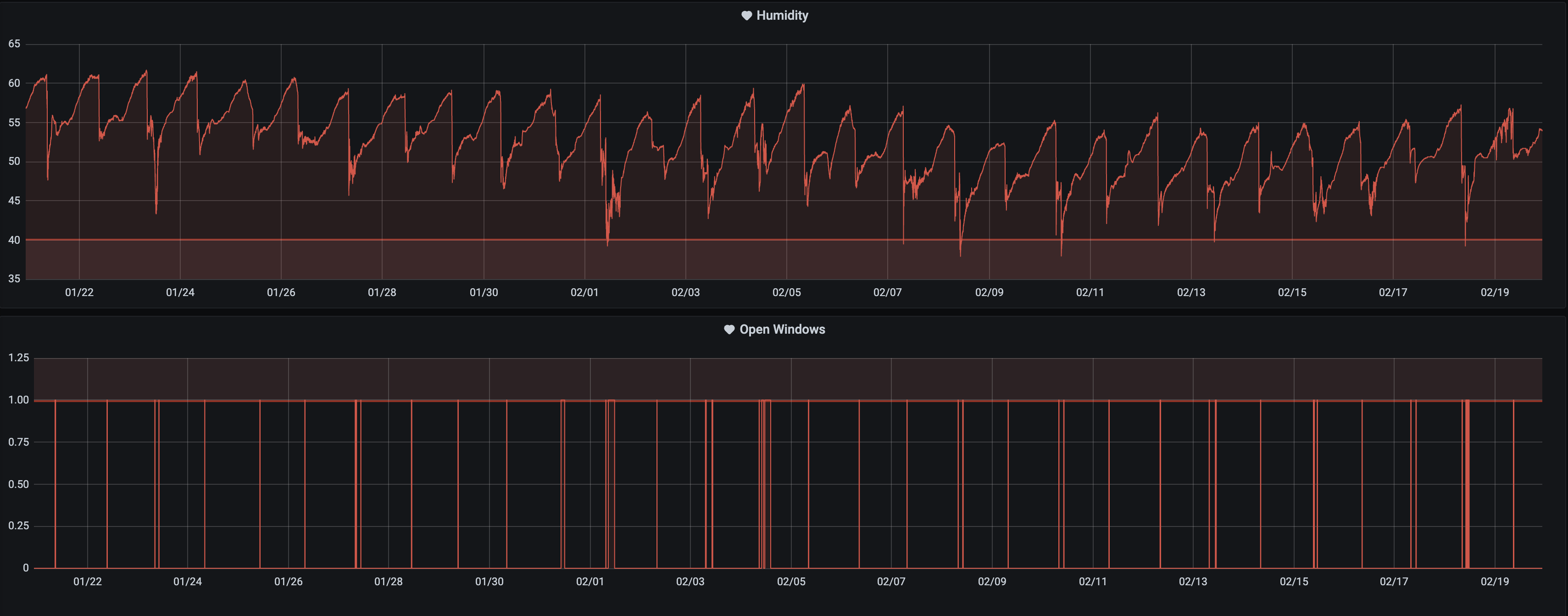
Do you see it? It’s pretty clear that we were correct in our assumption 😄.
More complicated would prove why the humidity dropped in the last 10 days. Any guess? You can find me on Twitter, LinkedIn or Mastodon..
Trend dashboards can be used for Troubleshooting, like finding the root cause of the problem but are also very useful for understanding how different parts of the system affect each other and how changes affect the system.
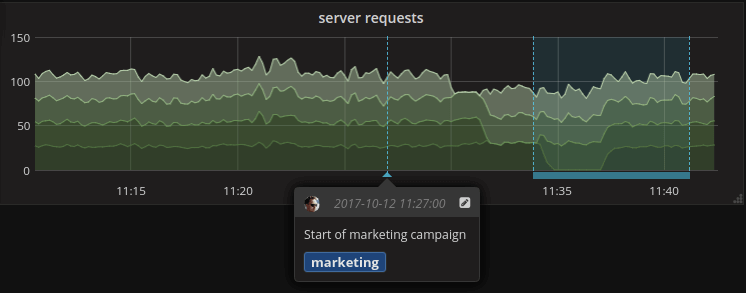
A perfect example of the above is when you push events like deployments or infra changes or the start of a marketing campaign to the system (Annotations in Grafana) as you can see in the image below.
How about adding your Software Deployment to the dashboards as a starting point?
One risk here is overdoing it; having metrics is good, and collecting a lot of them is still good with the proper caveats; same goes for retention BUT, showing all the metrics, adding all the events, and trying to correlate too many things might do the opposite of helping, as a famous person said: “With great power comes great responsibility”.
If the Status Dashboards required configuration in terms of Unit, Max value, and Thresholds, imagine what you need to do here to properly visualise and read the data.
In short, get all the data, hold into it (if you can, cough cough GDPR), but know how to use it.